So long, iTunes
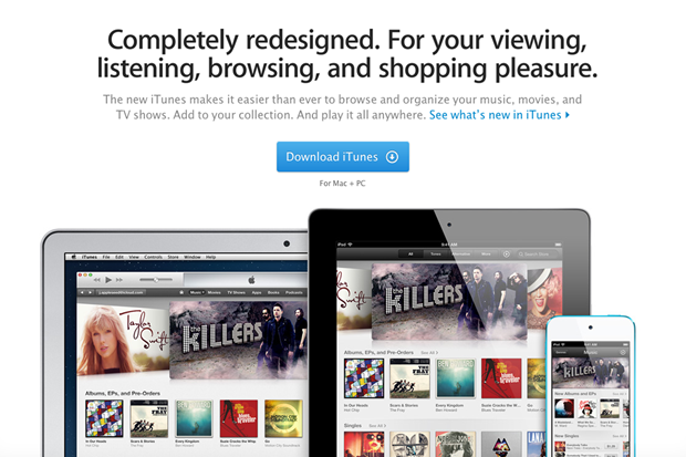
10. Apple has begun rolling out the 11th iteration of its iTunes media
player and store, and we're digging the redesigned interface, improved
search, ability to play content straight from iCloud and sync playback
across devices.
For more related stuff simply Like Tech-Attacks on Facebook or Follow us on our Blog .
For the most
part, the new iTunes feels like the old iTunes. The experience is much
faster though and has a decidedly more modern, streamlined user
interface featuring flashy,
colourful graphics. Apple has trimmed a lot of fat, but with so much
information to present and sort through, navigation can still feel a bit
convoluted, especially compared to minimalist services like Rdio.
As for the
interface, gone is the left-hand navigation panel that used to permeate
the experience. Now, you can toggle between the iTunes Store and your
Library through a button in the upper right of the iTunes window. In
your Library, a drop down menu in the upper left grants you access to
your music, movies, books, and other media. Once selected, you can swap between different views like songs, albums, and playlists (for music, for example). These are listed across the top of the iTunes window.
In the iTunes Store, which opens to a home screen highlighting side-scrolling album and poster art
for music, movies, TV shows, and apps, you can toggle between Apple's
different media offerings by clicking options like music, movies, or app store, again listed across the top of the iTunes window.
If you don't
know exactly what you're looking for, the main page for each store
presents a multitude of curated options to select from. As in previous
iTunes versions, the sheer number of app icons or images of album art
can be a bit overwhelming (especially when they're layered with rows of
rectangular icons highlighting specific content collections).
As for
searching, iTunes seems to do a pretty masterful job of figuring out the
context of what you're searching for, and producing a robust collection
of results in a matter of moments.
Other thoughts:
Playing music straight from iCloud is convenient, and worked without a
hitch for us so far. Playlist management is also much simpler than with
iTunes 10. Click the arrow next to a song to have it play next, or to
add it to your "Up Next" queue; alternatively, you can drag and drop a
title to the Up Next queue icon. The redesigned mini player is great,
showing the artist, title, and album art for the current song, which
toggles to a play-pause-next interface (plus an AirPlay button) when you
mouse over it. The Up Next queue icon is on the right of this mini
player, along with a search icon.
Apple has
clearly put a lot of thought into this iTunes redesign, and it shows. We
see no reason not to upgrade to iTunes 11, particularly if you are a
heavy user of Apple's media distribution and music playing platform. The
one thing that would make iTunes killer in our book is if it adopted a
simple cloud-based subscription service like Rdio and Spotify -- along with those services' equally simple interface.
You can Download iTunes 11 for FREE from Apple's website here .

No comments:
Post a Comment